The colours in our environment have a positive effect on performance and satisfaction.
Our range of colours contains a vast number of ever more beautiful tints and half tints.
Our goal is to create a pleasant, dynamic working atmosphere that encourages productivity and reduces stress.
Tip: for a successful visual effect we do not combine more than 3 tints.
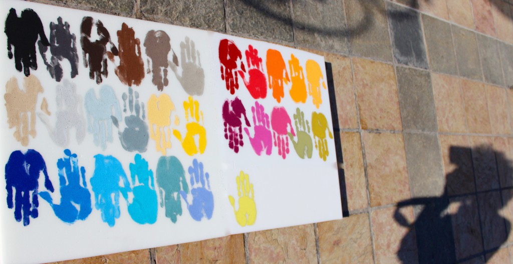
« We suggest you do not use a pure or a highly concentrated colour; we advise you to tint your colours in order to obtain a better effect. »

Give a soothing appearance to your Open Spaces

In this Open Space, 3 blue tints have been used. Blue is a soothing colour, and is suitable for open spaces that already possess a strong dynamic.
In addition to reducing noise in the room, the colour blue also helps to soothe tensions, and reduce fatigue and stress.
Soothing colours
BLUE

In the work environment, stress is constantly present; the pressure to reach goals is a source of stress to co-workers.
5 different tints of blue to be combined (not more than 3 simultaneously) or to grade off, using maroon.
PINK

Associated with tenderness, with happiness; think of the expression “looking at life through rose-tinted spectacles”.
Combine 3 tints of pink/violet with each other for an elegant effect!
GREEN

Green is relaxing to the eye and favours your co-workers concentration.
The 3 shades of green in the colour chart all combine perfectly.
MAROON

A colour that symbolises sweetness, partly thanks to its association with chocolate, which has a reassuring, protective taste.
4 shades of maroon, from the darkest to the palest.
Dynamic colours
RED

A fundamental symbol of the life principle, with its strength, its power and its brilliance. The colour red represents joie de vivre, optimism, vigour and fighting instinct.
It can be balanced out by shades of maroon, black or white.
ORANGE

Reminiscent of fire, the sun, light and heat. It is a warm, intimate and welcoming colour.
An ideal colour for creches, where it favours wakefulness and awareness.
YELLOW

A warm and stimulating colour that increases the size of a room and gives it depth.
Yellow is the perfect companion to shades of maroon, white and black.
Elegant colours
BLACK

Used in decoration, black provides a touch of modernity and elegance.
For your co-workers, black favours concentration and seriousness.
WHITE

White provides a luminous feel in your environment. It is a neutral colour that discreetly enlarges a room.
It is associated with purity, cleanliness and freshness; co-workers will feel better and will work better.
GREY

Halfway between white and black, grey is a soft tint; it is soothing and calming.
It is a discrete, elegant colour that goes well with practically all other colours.
BEIGE

Beige is chic, natural and timeless; it creates a soft and serene atmosphere in a room.
It combines well with other colours.
Modernise your boardrooms

Gray acoustic panels have been fitted in this boardroom; they accentuate the elegant and modern style of the existing room.
Reduce noise while preserving the elegance of your workspaces.
